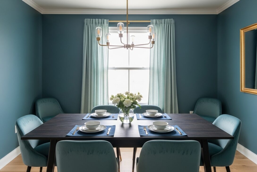
Blue green is the color that hesitates. You look at it and your brain pauses for half a beat, trying to label it. Teal? Sea glass? Something coastal but not beachy. Blue green dining room wallpaper ideas live in that pause. They don’t announce themselves. They hover. Then, slowly, the room starts behaving differently and you’re not sure why.
Blue green sits between calm and alert. Interior color research keeps pointing out that blue tones lower heart rate while green tones reduce visual fatigue. Put them together and you get a strange combo where people relax but stay mentally present. That’s a dining room sweet spot if there ever was one. You don’t rush the meal, but you don’t drift either.
I once sat under blue green walls and felt both awake and lazy. Confusing. Pleasant.
When blue green leans blue and the room cools down
Some blue green wallpapers lean hard toward blue, especially under daylight or cool bulbs. The dining room feels crisp. Conversations sharpen. Food presentation suddenly matters more. White plates look brighter. Silverware feels colder in the hand, even though it isn’t.
Environmental color studies show cooler wall tones can reduce perceived room temperature by a few degrees. That explains why blue-heavy blue green rooms feel refreshing in warm climates and slightly chilly in colder ones. You might reach for a sweater without realizing why.
Patterns help here. Organic shapes soften the coolness. Straight lines double down on it. I’ve seen a blue-leaning wallpaper with rigid geometry make a dining room feel like it was judging posture.
When green sneaks forward and settles things down
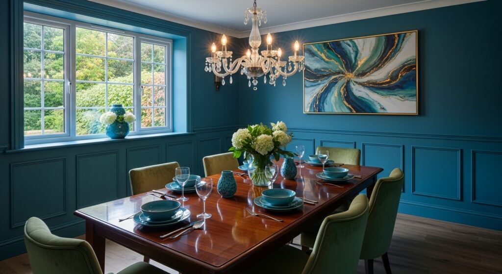
Shift the balance and let green dominate, and the same blue green wallpaper suddenly relaxes. The room exhales. Wood tones warm up. Even mismatched chairs stop looking accidental. Green-forward blue green tends to absorb light more evenly than blue-heavy versions, which smooths shadows during evening meals.
Studies on dining behavior suggest greener environments encourage longer meal durations. People linger. Plates sit half-finished while stories stretch. This shows up in both residential and commercial settings, oddly consistent across cultures.
I’ve noticed arguments soften in rooms like this. Not disappear. Just lose their edge.
Blue green and white where contrast starts doing quiet math
Add white into the mix and blue green starts playing tricks. White reflects both hues back into the room, depending on light direction. Morning feels bluer. Evening feels greener. The walls don’t change color, but your perception does, which is arguably worse.
Contrast research shows mid-tone wall colors paired with high-light elements keep visual engagement higher during seated activities. Dining again. That’s why blue green and white wallpapers don’t fade into the background. They keep nudging your attention without poking.
This combo works best when white isn’t pure. Slightly warm whites stop the blue from feeling sterile.
Dark blue green when the room turns inward
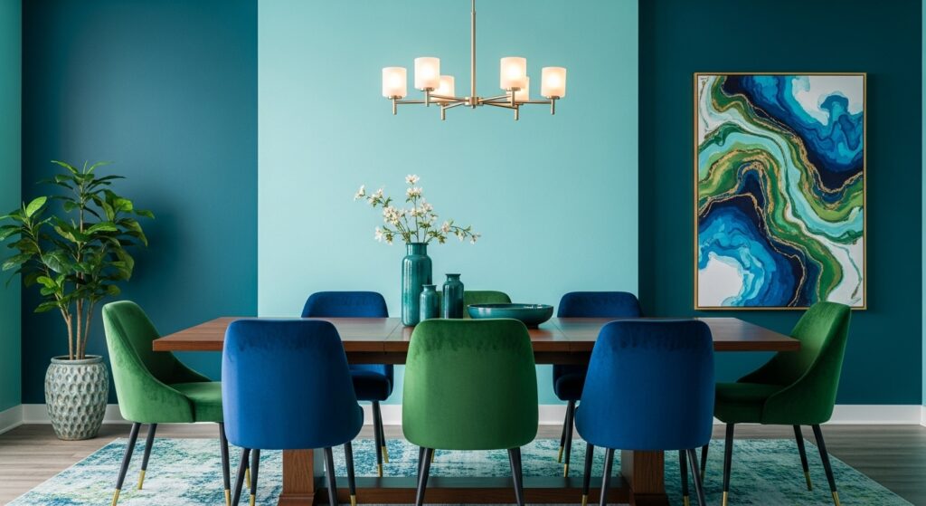
Deep blue green wallpaper pulls the dining room inward. It’s moody without being theatrical. Serious without being stiff. Meals feel intentional. Music sounds heavier. Laughter carries differently.
Lighting data backs this up. Darker blue green hues absorb a significant portion of visible light, similar to navy but less severe. Multiple light sources matter. One overhead fixture will fail you. Lamps and wall lights rescue the space.
Dark blue green pairs beautifully with imperfections. Scratched tables. A nicked chair leg. The color forgives wear better than lighter shades, which is probably why it shows up often in older homes that refuse to be precious.
Texture over pattern for people who get overwhelmed
Not everyone wants waves, leaves, or shapes staring back at them while they eat. Textured blue green wallpapers offer a quieter route. Linen effects. Soft grain. Subtle embossing that only shows when light hits sideways.
Replacement cycle data from hospitality interiors shows textured blue green surfaces last longer before renovation than bold prints. Less fatigue. Fewer regrets. The trade-off is installation precision. Every seam matters. Every bubble is permanent in your memory.
I’ve watched someone touch a textured wall absentmindedly while thinking. That tells you something.
Vintage blue green that feels borrowed not trendy
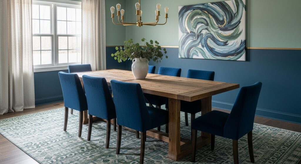
Vintage-inspired blue green wallpaper carries a faded confidence. Think muted tones, slightly gray undertones, whites that look like they’ve seen sunlight for decades. These patterns don’t shout era. They imply one.
Historical trend analysis shows blue green resurfaces during periods when people want calm without dullness. It’s safe but not sleepy. Dining rooms with this look feel like they’ve hosted many meals already, even if they haven’t.
You trust a room like that faster.
Furniture reactions that sneak up on you
Blue green walls quietly recalibrate furniture. Brass warms. Black softens. Chrome sharpens, sometimes too much. Wood grains become more noticeable, especially lighter woods that pick up the green side.
Material perception studies suggest blue green backdrops increase contrast sensitivity. You notice textures more. Finish quality matters more. Cheap shortcuts show faster.
You might blame the furniture. It’s not the furniture.
Maintenance things nobody mentions at the store
Dining rooms get messy in slow ways. Steam. Oils. Condensation. Blue green wallpapers with washable finishes perform better over time, especially darker shades that hide minor marks. Paper-backed options show stains sooner, particularly around seating height.
Matte finishes hide fingerprints better than satin. Satin reflects sideways, which highlights every smudge during dinner lighting. This becomes obvious after the third gathering, not the first.
Nobody warns you then.
Ending that refuses to summarize
Blue green dining room wallpaper ideas don’t land cleanly in one category. They shift. They argue with light. They change tone depending on who’s sitting at the table and how long they stay. Some nights the room feels cool and thoughtful. Other nights it feels grounded and slow.
That instability is the point. Dining rooms aren’t static spaces. They’re places where moods arrive unannounced. Blue green handles that better than most colors, even if it never fully explains itself.
Last modified: January 29, 2026

