Green and blue dining room ideas sound calm on paper. Coastal maybe. Safe. Balanced. Then you actually live with it and realize the room keeps changing its mind. Blue pulls one way. Green pulls another. The dining room sits in the middle, negotiating quietly while you eat.
Green and blue together don’t behave like a color pair. They behave like weather. Morning light makes the blue louder. Evening light lets green take over. Studies on color perception in interior spaces show blue hues reflect less warm light than green, which explains why dinners feel cooler at night even when the thermostat didn’t move. People swear the room feels different. They’re not wrong.
I used to think this combo was obvious. It’s not. It’s fussy in a low-key way.
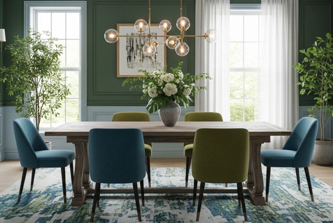
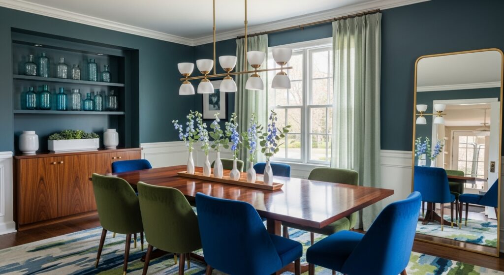
When green leads and blue follows reluctantly
Some dining rooms lean green first. Blue shows up in patterns, accents, undertones you don’t notice until you stop looking directly. This setup makes the room feel grounded but not sleepy. Green anchors. Blue keeps things from getting too earnest.
Interior behavior research suggests green-forward rooms support longer seated activities, while blue-forward rooms shorten them slightly. Together, they land somewhere in the middle. Meals don’t rush. They also don’t drag. That balance is rare.
Furniture reacts differently here. Wood feels warmer. Upholstery looks deeper. White trim shifts cooler than expected, especially in the afternoon. I once repainted trim twice before realizing the wall colors were messing with my eyes.
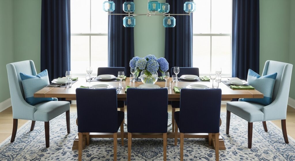
Blue-heavy rooms where green sneaks in later
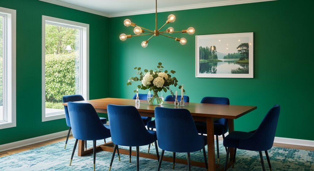
When blue dominates, the dining room feels more controlled. Cleaner. Slightly distant. Green elements then soften the edges, stopping the space from feeling like a conference room that accidentally got a table.
Color usage data from residential dining spaces shows blue-heavy palettes are chosen more often in homes with open floor plans. Probably because blue visually separates the dining area without walls. Green then reconnects it to the rest of the house.
This combo works best when the blue isn’t too clean. Navy, slate, dusty teal. Bright blue makes green look sickly. Nobody wants that near food.
Patterns where green and blue argue quietly
Patterned wallpaper or painted motifs bring tension into green and blue dining rooms. Florals feel softer. Geometric patterns feel sharper. The trick is letting one color dominate the background while the other handles detail.
Visual fatigue studies show high-contrast multicolor patterns can exhaust attention faster during seated activities. Dining rooms with medium-contrast green-blue patterns hold attention longer without irritation. That’s science backing up what people feel but don’t explain.
I’ve sat through three-hour dinners in rooms like this without noticing the time. That doesn’t happen everywhere.
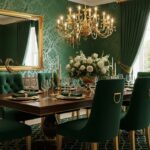
Dark green and deep blue when the room turns serious
Pairing dark green with deep blue pushes the dining room into grown-up territory fast. The air feels heavier. Sound changes. Plates clink louder. Conversations slow down without permission.
Lighting data matters here. Dark blues and greens absorb light differently, with blue swallowing warmth and green dulling brightness. Layered lighting becomes essential. Overhead alone won’t cut it. Lamps help. Candles help more.
This setup makes cheap furniture look unforgiving. It also makes old furniture look incredible. Scratches feel intentional. Worn edges blend instead of standing out.
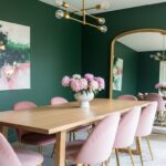
Soft green with muted blue for rooms that overthink less
Pale green with washed blue creates a dining room that feels relaxed but not lazy. Think eucalyptus and faded denim. These spaces respond well to natural light and struggle under harsh LEDs.
Environmental psychology research shows softer green-blue combinations lower perceived stress more effectively than either color alone. People lean back more. Voices drop slightly. Meals stretch just enough.
I’ve noticed people linger after clearing plates in rooms like this. Nobody rushes to stand. That’s not an accident.
Texture matters more than color here
In green and blue dining rooms, texture often decides success more than shade. Matte finishes calm things down. Glossy finishes bounce color back into the room, sometimes too much.
Textured walls soften blue dominance. Smooth walls sharpen it. Fabric chairs absorb green warmth. Leather reflects blue coolness. These interactions add up fast.
Design maintenance data shows textured finishes hide wear better in multi-color rooms. Flat painted walls show scuffs quicker when two strong colors are involved.
You learn this after the first chair scrape.
Furniture choices that feel right then suddenly wrong
Green and blue walls are picky about furniture. Brass looks warmer. Black looks crisper. Chrome feels out of place unless balanced carefully. Wood tones deepen visually, especially under evening light.
Material perception studies suggest blue-green environments amplify contrast in adjacent materials. That’s why dining sets either look amazing or slightly off with no in-between.
You might replace one chair and suddenly hate the rest. That happens.
Practical things nobody brings up at the start
Dining rooms deal with heat and humidity. Blue shows stains differently than green. Green hides grease better. Blue hides water marks better. Combined, they forgive some messes and expose others.
Washable finishes matter. Matte hides fingerprints. Satin reflects them sideways. Data from interior maintenance reports shows multi-color dining rooms benefit from higher durability coatings more than single-color ones.
Sample boards never show this.
Ending without deciding anything
Green and blue dining room ideas don’t land on one feeling. They slide. Morning to night. Quiet dinner to loud one. Calm week to chaotic one. The room adapts, sometimes faster than you do.
That tension is the appeal. A dining room doesn’t need to commit to one mood. It just needs to hold people long enough for something real to happen. Green and blue manage that, even when they don’t agree with each other.
Last modified: January 29, 2026