You think green and grey dining room ideas are about balance. Equal parts calm and serious. Then you live with it and realize the room keeps switching alliances. Some mornings the green runs the place. By dinner, the grey has taken over like it paid rent early. This color pairing doesn’t settle. It negotiates daily.
Interior color preference data keeps ranking grey as a “safe anchor” shade, while green consistently scores higher for emotional comfort. Put them together and you get rooms people describe as grown-up without sounding bored. That phrasing shows up a lot in surveys. Nobody says exciting. Nobody says dull either. That middle ground is where dining rooms seem to thrive.
I once thought grey killed personality. Turns out it just waits.
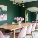
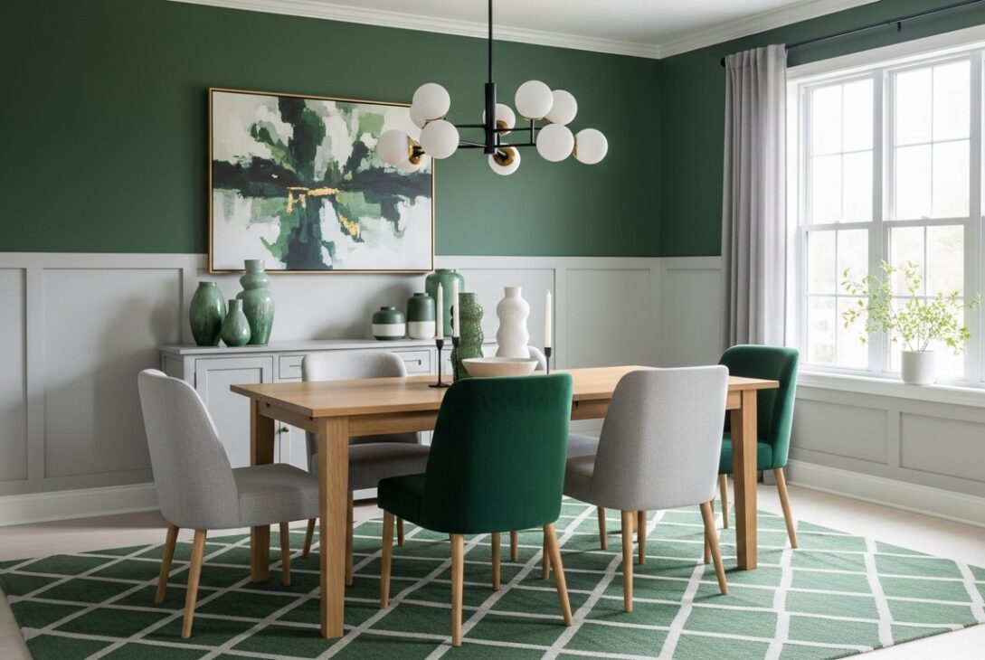
When green leads and grey pretends to be neutral
In some dining rooms, green takes charge and grey plays support. Sage walls with grey chairs. Olive wallpaper with concrete-toned trim. The green brings warmth. The grey keeps it from feeling like a plant store.
Spatial perception studies suggest grey recedes visually while green advances slightly. That means green walls feel closer, more present, while grey furniture fades back. This setup works well in narrow dining rooms where you want the walls to feel intentional, not accidental.
Too much grey though and the green gets lonely. It starts feeling decorative instead of structural. That’s when rooms feel staged, not lived in.
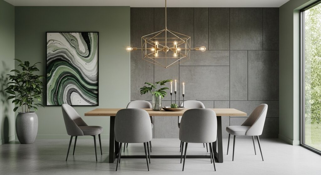
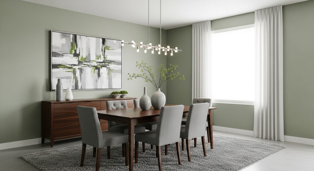
When grey dominates and green sneaks in sideways
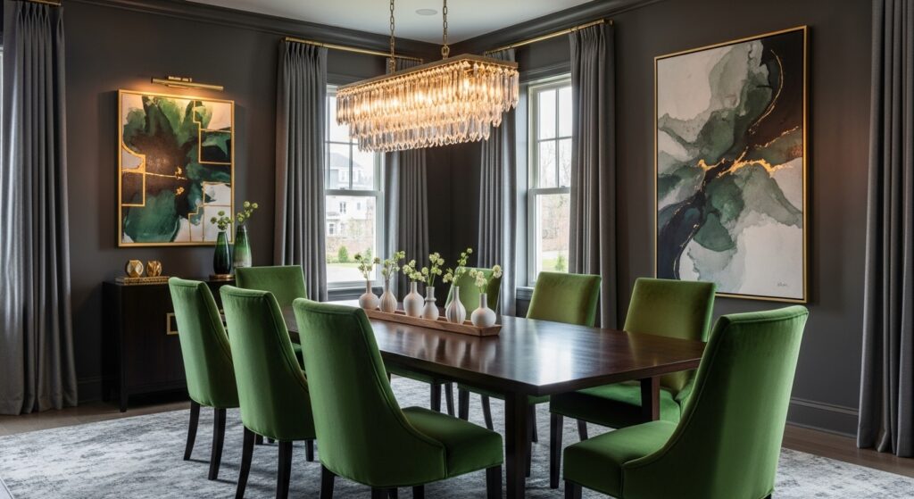
Flip it around. Grey walls, green accents. Grey wallpaper with subtle green undertones works differently. The room feels cooler, steadier, more controlled. Green shows up in chairs, art, plants, sometimes just in the undertone of the wallpaper itself.
Color interaction research shows green appears more saturated against grey backgrounds than against white. That means even small green elements feel louder. One green chair suddenly matters. One green vase starts bossing the table.
This setup suits dining rooms that double as workspaces. The grey keeps things focused. The green stops it from feeling like an office that happens to have plates.
Green and grey patterns that mess with depth
Patterned wallpapers in green and grey play tricks. Vertical elements stretch the room. Horizontal ones calm it down. Organic patterns soften the grey. Geometric ones sharpen the green.
Design testing shows mid-contrast patterns hold attention longer during seated activities than low-contrast ones. That matters in dining rooms. People stare at walls more than they realize. Especially when conversations stall.
I sat through a long dinner once staring at a green-and-grey trellis pattern and forgot half the table talk. The wall was louder. That’s not always bad.
Dark green and pale grey for rooms that slow conversations
Dark green paired with pale grey does something strange. It lowers the room’s tempo. People speak slower. Meals stretch. The grey lightens the heaviness of the green without canceling it.
Lighting studies back this up. Dark greens absorb light. Pale greys reflect it softly. Together they create even illumination without glare. That’s why this combo feels calm without feeling sleepy.
This works best with simple furniture. Overdesigned pieces start fighting for attention. The room already has enough going on.
Texture over color when both feel too loud
Sometimes it’s not about hue at all. Textured green wallpaper paired with flat grey surfaces, or vice versa. Linen-look greens. Concrete-effect greys. The contrast shifts from color to surface.
Material response data from interior environments shows texture reduces perceived color intensity. That’s why textured green feels softer than painted green, even if the shade is identical. Dining rooms benefit from this. Less visual fatigue. Fewer regrets.
The downside is installation. Texture shows flaws. Grey shows dust. Green shows fingerprints. The room remembers everything.
Furniture and finishes react whether invited or not
Green and grey dining rooms are honest about materials. Wood warms up fast. Black metal sharpens. Chrome cools the space too much sometimes. Brass behaves nicely, bridging the gap.
Studies on material perception indicate green-grey environments heighten awareness of finish quality. Cheap laminates look cheaper. Real wood looks better. You start noticing grain direction, not just color.
This leads to slow upgrades. One chair replaced. One light fixture swapped. You pretend it’s coincidence.
The parts nobody plans for
Grey walls show scuffs faster than green. Green walls show stains differently. Dining rooms see both. Washable finishes matter more here than in living rooms. Maintenance data consistently shows dining areas experience higher wall contact frequency than people expect.
Matte finishes hide more sins than satin. Satin reflects fingerprints sideways. Matte lets them disappear into the background. This isn’t aesthetic advice. It’s survival.
Conclusion
Green and grey dining room ideas don’t resolve cleanly. They adjust. They lean one way, then another, depending on light, furniture, food, and mood. Some days the room feels calm. Other days it feels strict. Occasionally it feels like it’s judging the table setting.
That’s fine. Dining rooms aren’t meant to stay neutral. They’re meant to host, absorb, and occasionally disagree. Green and grey do that quietly, without asking you to choose sides.
Last modified: January 29, 2026