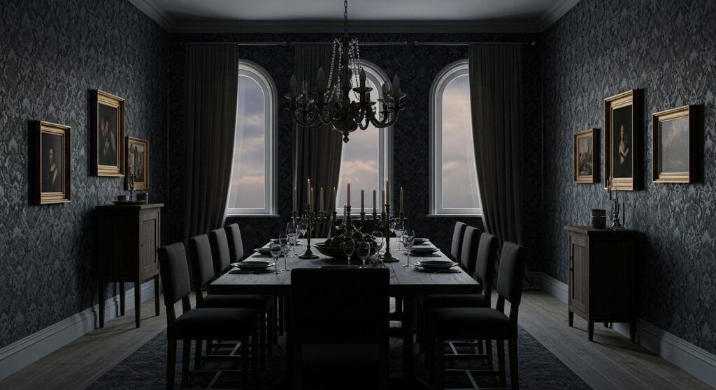
Dark, moody dining room wallpaper isn’t chosen when you’re feeling cheerful and decisive. It’s picked on a Tuesday night, probably after staring at the room too long, thinking it feels thin somehow. Too exposed. Too polite. Dark moody dining room wallpaper ideas show up when you want the walls to hold the sound instead of bouncing it back.
Dark colors do something odd to time. Meals feel slower. Pauses stretch. Studies on low-light interior environments show people linger longer at tables with darker surrounds, even when food portions and lighting levels stay the same. The room changes behavior, not the menu.
I once sat in a nearly black dining room and forgot to check my phone for an hour. That never happens. Still don’t fully trust it.
When darkness makes the room feel smaller but more intentional
Dark wallpaper compresses space. That’s not a theory, it’s measurable. Perception research shows deep hues can reduce perceived room volume noticeably. In dining rooms, that squeeze often feels deliberate, like the space was designed for conversation, not circulation.
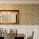
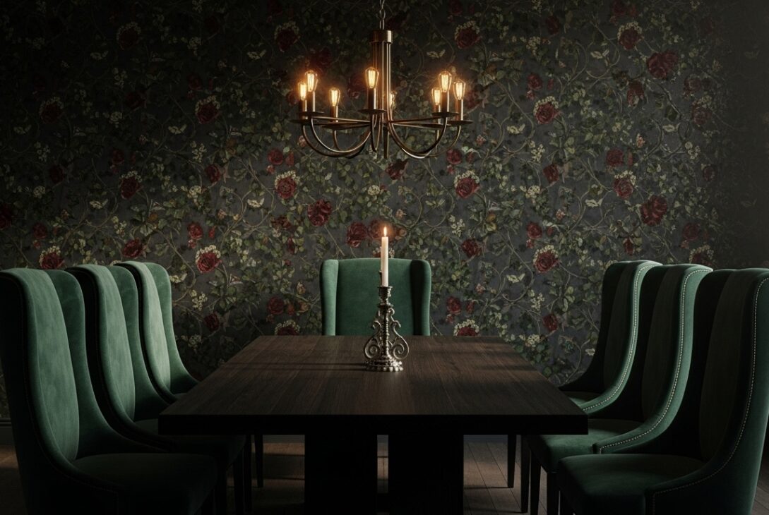
Moody doesn’t always mean black. Charcoal, deep ink blue, smoked plum, green so dark it barely admits it’s green. Patterns matter less here. Even simple textures feel dramatic once the color drops low enough.
I’ve seen people reject dark walls thinking the room will feel cramped. Then they sit down and realize cramped isn’t the same as intimate.
Patterned darkness that almost hides itself
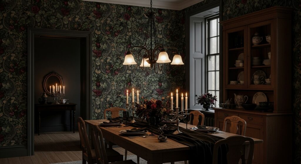
Dark patterned wallpapers behave differently than light ones. The pattern doesn’t announce itself. It waits. You notice it when the light hits sideways or when you’re staring between bites. Floral motifs feel more serious. Geometrics feel heavier. Even playful designs calm down under dark ink.
Print visibility studies show low-contrast patterns reduce visual fatigue during prolonged seating. That’s why dark-on-dark wallpapers work well in dining rooms. Your eyes aren’t constantly tracking edges.
I once didn’t notice a damask pattern for weeks. Then one night it appeared out of nowhere and never left again.
Moody wallpaper and lighting that refuses to cooperate
Lighting becomes personal in dark dining rooms. Overhead fixtures alone rarely work. Dark walls absorb light aggressively, sometimes over 30 percent more than pale finishes. Layering becomes survival, not style.
Warm bulbs soften shadows. Lamps bring walls forward. Candlelight does something electric. LED panels tend to feel wrong, too flat, like they’re exposing the trick.
People blame the wallpaper when the room feels off. It’s usually the lighting sulking.
When dark walls make food look different
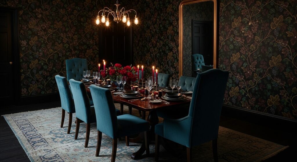
This part surprises people. Dark dining rooms change how food reads visually. Whites look brighter. Reds deepen. Greens pop harder. Color perception research confirms darker surroundings increase contrast sensitivity on lighter objects. Plates become focal points without trying.
That’s why restaurants lean moody. Not because it’s trendy, but because it makes food feel deliberate. At home, this can make simple meals feel heavier, richer, more intentional than they actually are.
I once thought a salad looked dramatic. That’s when I knew the room was winning.
Texture over pattern for people who hate obvious drama
Textured dark wallpapers do something quieter. Grasscloth-inspired finishes, brushed looks, linen textures soaked in shadow. These don’t shout. They hum. The walls feel close without being loud.
Replacement data from hospitality interiors shows textured dark wallpapers last longer than bold prints in dining areas. Less fatigue. Fewer regrets. The trade-off is maintenance. Dust shows. Scuffs linger. You start noticing corners more than you want to.
Dark rooms reward attention. They punish neglect.
Furniture that either rises or disappears
Dark wallpaper edits furniture brutally. Light wood glows. Dark wood blends. Metal accents either sparkle or vanish depending on finish. Upholstery colors matter more than before. Beige looks dirty. White looks intentional. Gray becomes complicated.
Material interaction studies show high-contrast environments amplify perceived quality differences. Cheap furniture gets exposed. Well-made pieces feel heavier, more serious.
People often replace furniture slowly after going dark. One chair at a time. They pretend it’s unrelated.
Practical realities nobody romanticizes
Dark wallpaper shows installation mistakes mercilessly. Seams catch light. Bubbles cast shadows. Dining rooms make this worse because people sit and stare at the same walls repeatedly.
Humidity matters too. Heat from food, steam, bodies. Washable finishes perform better long-term. Matte hides flaws better than satin. Satin reflects mistakes back at you.
Maintenance reports consistently show darker wallpapers last visually longer but demand better prep upfront. Skip prep and the wall never forgets.
Conclusion
Dark moody dining room wallpaper ideas aren’t about coziness or drama alone. They’re about control. About choosing how the room feels at night when everyone’s seated and nobody’s rushing.
Some days it feels luxurious. Other days it feels heavy. Occasionally it feels like the room knows more than you do.
That’s fine. Dining rooms don’t need to be friendly all the time. Sometimes they just need to be honest.
Last modified: January 29, 2026