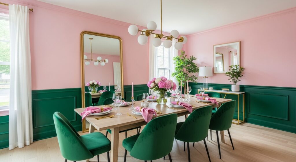
You hear green and pink dining room ideas and your brain probably jumps somewhere loud. Too playful. Too trendy. Too much. Then you sit in one, accidentally, and realize the room isn’t loud at all. It’s just awake. Green steadies things. Pink pokes them. Together they don’t blend, they negotiate. That tension is the whole point, even if nobody says it.
Color pairing studies in residential interiors show green and pink combinations hold attention longer than monochrome schemes. Not because they’re brighter, but because the eye keeps recalibrating. That sounds academic. What it really means is people look up more during dinner. They notice walls. They notice each other. That’s rare.
I once thought pink in a dining room was a mistake. Then I watched a serious conversation happen under blush walls and nothing fell apart.
When green does the grounding and pink does the interrupting
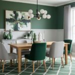
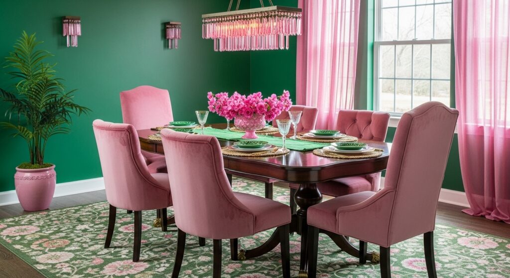
In most green and pink dining rooms, green carries the weight. Sage, olive, eucalyptus tones settle the space. Pink shows up as an interruption, not an anchor. Soft blush, dusty rose, sometimes even muted coral if someone’s feeling brave.
This balance matters. Environmental color research suggests rooms feel more stable when one hue dominates and the second acts as an accent. Too much pink and the room floats. Too much green and it gets sleepy. Together, when done unevenly, they stay alert.
I’ve noticed food tastes different in these rooms. Salads feel fresher. Desserts feel intentional. That might be psychological, but so is everything else.
Pale pinks that don’t try to be cute
Pale pink dining room wallpaper or painted panels paired with green furniture often surprise people. The pink recedes. It behaves more like warmth than color. Green chairs or trim then pop harder, grounding the softness.
Studies on perceived temperature show pink hues can make rooms feel slightly warmer without increasing actual temperature. That’s useful in dining rooms that feel drafty or sterile. Green counters that warmth visually, keeping things from tipping into sweet.
There’s a kind of honesty to this combo. It doesn’t flirt. It just exists.
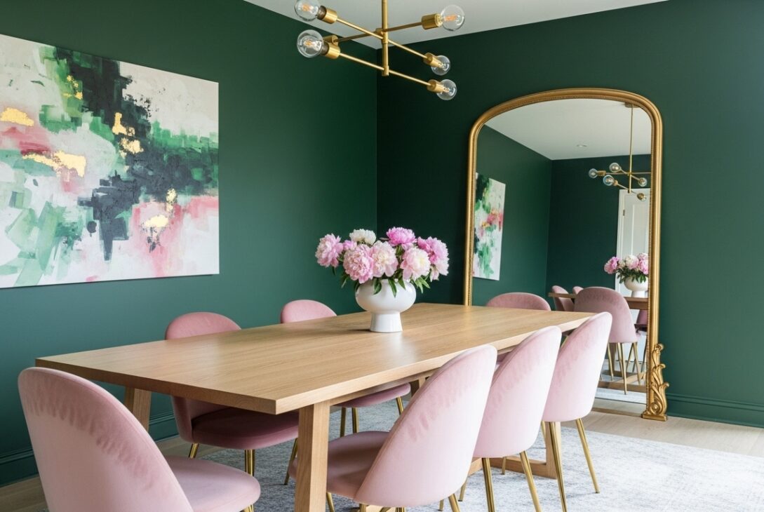
Dark green with muted pink when the room wants gravity
Dark green walls with muted pink accents flip the usual script. Forest or deep olive green carries the mood. Pink shows up sparingly. Upholstery. Art. Maybe wallpaper details if someone trusts themselves.
Lighting data supports this pairing more than people expect. Dark greens absorb light. Pink reflects it softly. Together they balance glare and shadow better than dark green alone. Dinners feel slower. Conversations drop into longer pauses.
I once sat in a room like this where nobody checked their phone for an hour. I noticed because I did check mine, once, then stopped.
Patterns where pink sneaks in instead of shouting
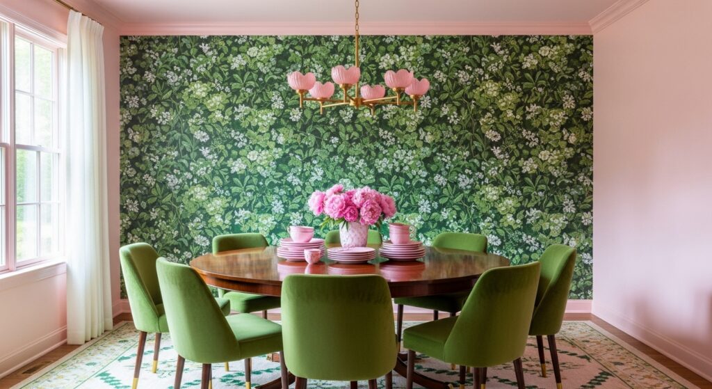
Patterned wallpapers are where green and pink can either sing or argue. Florals work when the pink isn’t dominant. Botanical prints where green leaves lead and pink flowers follow tend to age better. Geometric patterns are riskier. Too clean and the colors start competing.
Interior fatigue studies show high-contrast multi-color patterns tire viewers faster in seated spaces. Dining rooms count. That’s why softer contrasts, dusty pink against muted green, stick around longer without regret.
I’ve seen someone fall out of love with a bold pink-and-green geometric wall in under a year. The leaves were sharp. The pink was loud. The room never relaxed.
Furniture reactions that feel personal for some reason
Green and pink walls mess with furniture perception. Wood tones warm up fast. Black furniture looks intentional, almost graphic. Brass and gold lean theatrical. Chrome feels wrong more often than not.
Material perception research shows pink hues increase perceived softness of nearby objects. Green does the opposite. The push-pull makes furniture choices feel more emotional than logical. You don’t just pick a chair. You react to it.
People replace things faster in these rooms. Not because they’re unhappy. Because the room keeps asking questions.
Vintage green and faded pink for people who hate trends
Vintage-inspired green and pink dining rooms feel borrowed, not installed. Muted pistachio with dusty rose. Soft mint with pale salmon. These palettes show up repeatedly in historical design cycles, especially mid-century periods.
Trend analysis shows green-pink combinations spike during cultural shifts, then fade, then return quieter. Vintage versions last longer because they don’t announce themselves as current.
I ate dinner once in a room like this and couldn’t tell if it was styled or inherited. That confusion felt comforting.
Practical stuff that ruins the mood if ignored
Pink shows stains faster than green. That’s just reality. Dining rooms see spills, grease, fingerprints. Performance data from wallpaper manufacturers shows darker or muted pinks hide wear better than pale blush, especially in high-use rooms.
Green hides more, but reflects grime differently. Matte finishes forgive more than satin. Washable coatings matter more here than people think.
Nobody wants to talk about maintenance when choosing colors that already feel risky. But regret usually shows up as a stain, not a shade.
Conclusion
Green and pink dining room ideas aren’t about harmony. They’re about friction that works. One color steadies. The other interrupts. The room stays awake because of it.
Some nights it feels playful. Other nights it feels serious. Occasionally it feels like it’s daring you to say something honest at the table.
That’s not a flaw. That’s exactly why the pairing keeps coming back, even when people pretend they’re over it.
Last modified: January 29, 2026