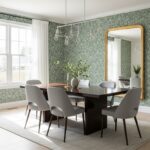
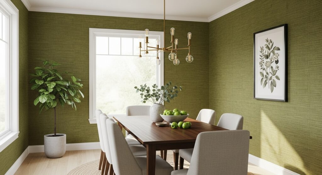
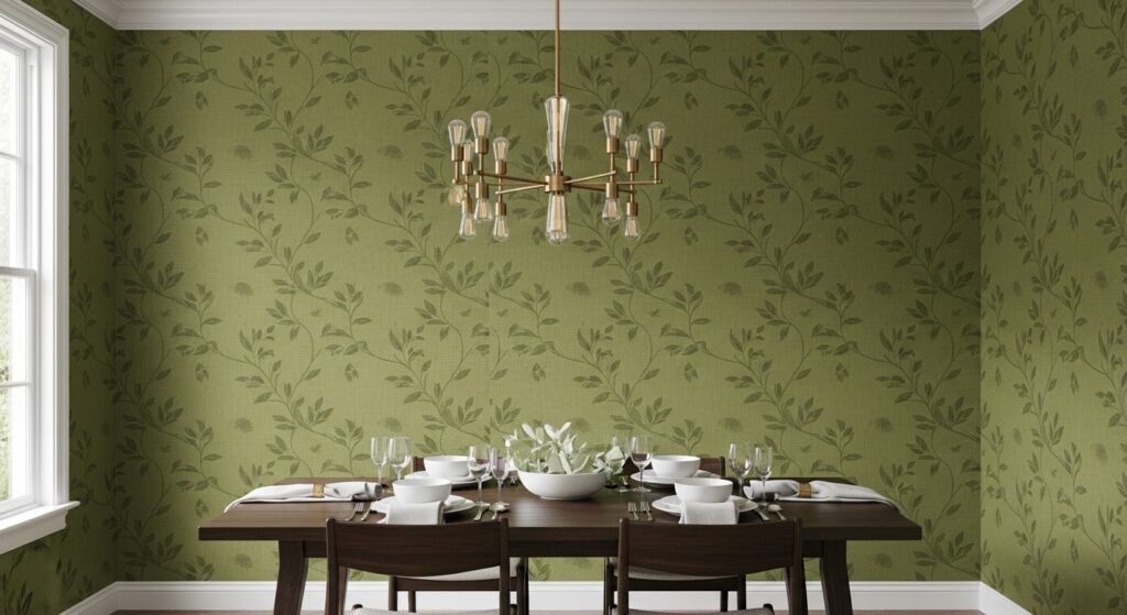
You don’t notice olive green dining room wallpaper right away. That’s the trick. At first it feels neutral-ish, almost background noise. Then you sit down. Plates hit the table. Someone clears their throat. The room tightens a little, not in a bad way, just more aware. Olive does that. It waits.
Color studies in residential interiors keep showing olive and similar mid-tone greens rank unusually high for long-term satisfaction. People don’t gush about it, they just stop wanting to repaint. That’s a different kind of success, quieter, stubborn almost.
I used to think olive was just green that gave up. Turns out it’s green that learned patience.
Olive that leans brown
Some olive wallpapers tilt brown, especially under warm bulbs. That shift matters. The dining room starts reading heavier. Tables look thicker. Chairs seem closer together even when they’re not. Spatial perception research shows mid-to-dark earthy greens can compress perceived space by several percent, which explains why dinners in these rooms feel more focused, less scattered.
Patterns matter here. Loose organic shapes work better than tight repeats. Too much structure and the olive turns muddy, like it’s been overthought. I’ve seen a dining room with a perfect grid pattern in olive feel oddly tense, like the walls were counting bites.
If your floor is dark, this shade doubles down. If your floor is light, the walls take control.
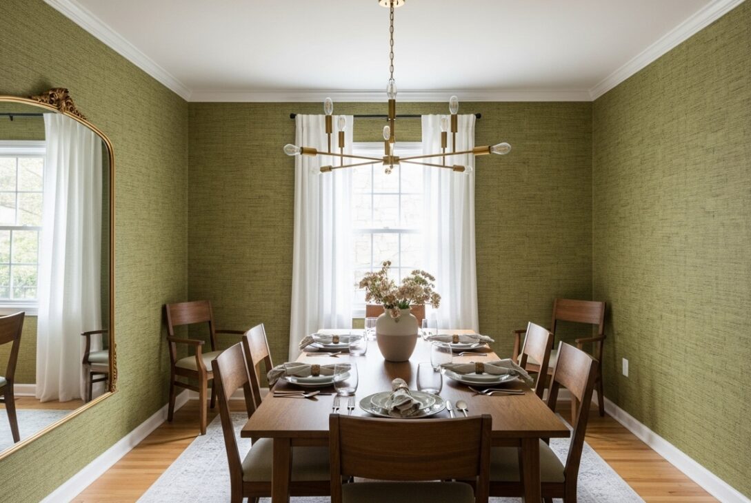
Olive and white
Add white into olive wallpaper and suddenly the white isn’t neutral anymore. It starts reflecting olive back into the room. Plates look warmer. Trim looks creamier even if it’s not. Designers don’t always mention this feedback loop, but it’s real.
Contrast studies show moderate light-dark pairings keep visual interest higher during seated activities. Dining counts. That’s why olive-and-white wallpapers hold attention longer than beige combos. People stay engaged. Conversations stretch. Someone always refills water they didn’t finish.
I once noticed guests stop leaning back in their chairs in a room like this. They stayed forward. Listening posture. Could be coincidence. Could be color.
Dark olive
Dark olive wallpaper doesn’t flirt. It commits. The room feels serious even if the furniture isn’t. Jokes land differently. Background music feels louder. White accents become necessary, not decorative.
Lighting data backs this up. Dark greens absorb more visible light than most neutrals, meaning overhead fixtures need reinforcement. Warm bulbs help. Multiple sources help more. Candlelight softens olive better than LEDs ever will.
This is the shade that makes mismatched furniture work. Scratches disappear. Wood grain deepens. New pieces look out of place for a while, like they need to earn their seat.
Textured olive
Some people hate obvious patterns. They feel watched by them. Textured olive wallpapers solve that quietly. Linen-look finishes, soft embossing, low-relief textures that you notice only when light hits sideways.
Sales data from commercial dining installations shows textured green wallpapers last longer before replacement than printed ones. Less visual fatigue. Fewer regrets. The downside is installation sensitivity. Seams show faster. Bubbles haunt longer.
I’ve seen someone stare at a textured olive wall for months before realizing it wasn’t painted. That’s the appeal.
Vintage olive that feels inherited not installed
Vintage-style olive wallpaper has history baked in. Muted tones. Slightly off-white backgrounds. Patterns that feel borrowed from a decade nobody agrees on. These designs often use lower saturation, which helps them age slower.
Historical trend analysis shows olive resurges during periods of economic uncertainty. People choose grounded colors when things feel shaky. That energy sticks around. Dining rooms wrapped in vintage olive feel steady, even when the table wobbles.
I ate in one once and felt like the room knew things it wasn’t telling.
Furniture
Olive green walls quietly edit your furniture. Black looks sharper. Brass glows more than expected. Chrome feels colder, sometimes wrong. Wood darkens visually, especially oak and walnut.
Material perception studies show mid-tone greens increase perceived richness of surrounding surfaces. That’s why olive dining rooms often feel pricier than they are. It’s also why cheap finishes get exposed fast. Olive doesn’t hide flaws. It highlights them politely.
You start replacing things slowly. One chair. One light fixture. You tell yourself it’s unrelated.
Practical details
Dining rooms are humidity traps. Steam, heat, bodies. Wallpaper performance data shows vinyl-coated or washable olive wallpapers resist staining longer than paper-backed options. Olive hides grease better than pale greens, but it remembers it.
Matte finishes forgive more than satin. Satin reflects stains sideways. Matte absorbs them into the background. Nobody mentions this while you’re holding samples under store lighting.
They should.
Last modified: January 29, 2026