You land on sage green dining room wallpaper ideas thinking you’re choosing neutral, the sensible option, the grown-up move. Sage sounds polite. Sage sounds like it won’t argue with your table or your chairs. And then the wallpaper goes up and suddenly the room has a temperature. Not literal, but emotional, like it’s deciding how long people should stay after dessert.
Sage green sits in that odd middle zone. It’s green but it doesn’t shout plant. It’s gray but not tired. Color research keeps placing sage and similar muted greens among the most tolerated wall colors over long periods, which is a dry way of saying people don’t get sick of it fast. That matters in a dining room where walls get stared at while chewing. You notice everything when you’re chewing.
I once thought sage was boring. Then I ate pasta in a sage-wrapped room and stayed an hour longer than planned, plates untouched, conversation drifting. That’s not a coincidence, I don’t think.
When sage leans warm and the room relaxes
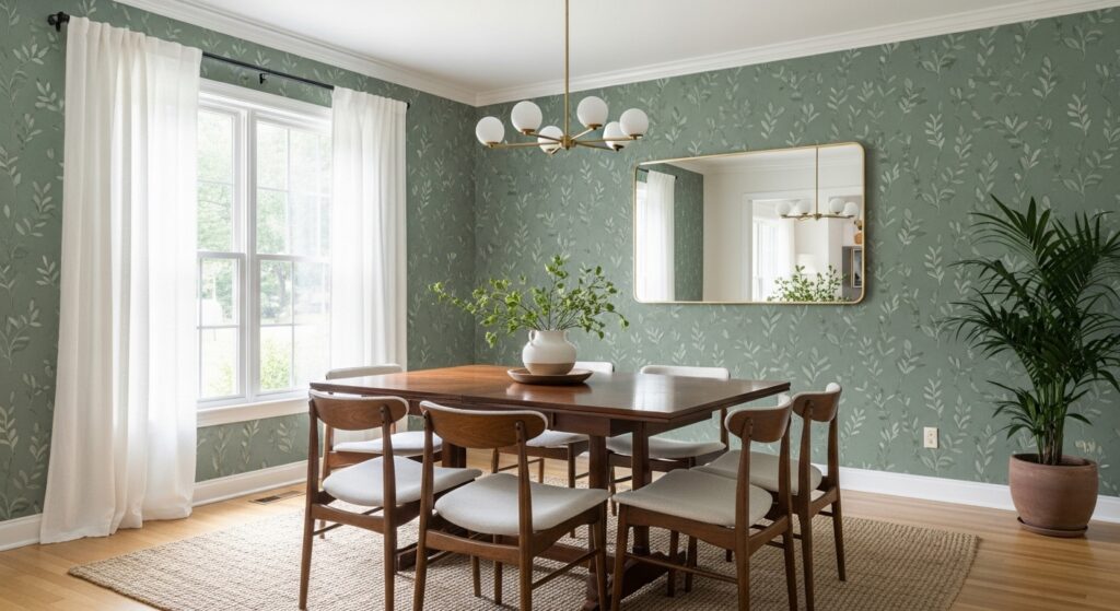
Sage green wallpaper with warm undertones almost behaves like a neutral paint, but with texture and rhythm sneaking in sideways. When paired with cream or soft white patterns, the room feels padded somehow, like it forgives bad lighting and uneven furniture choices. Warm sage works especially well in dining rooms facing north, where daylight is thin and a bit moody.
Interior lighting studies show warmer greens reflect light more evenly than cooler greens, reducing harsh contrast at night. Translation: faces look better at dinner. People don’t know why they look better, they just do.
This is where linen textures, brushed metals, and slightly worn wood stop looking accidental and start looking intentional. Even if they weren’t.
Cool sage
Cool-toned sage green wallpaper is quieter at first glance. It looks restrained. Almost minimalist. But it can tip into feeling distant if the pattern is too flat or the white is too crisp. Cool sage likes balance. It needs warmth somewhere else or it sulks.
There’s data behind that discomfort feeling. Studies on color temperature perception show cooler greens can increase perceived room distance, making spaces feel slightly larger but also less intimate. In a dining room, that can either feel elegant or awkward depending on how close the chairs are.
I’ve sat in cool sage dining rooms that felt like waiting rooms for dinner. Same color, wrong context.
Patterns
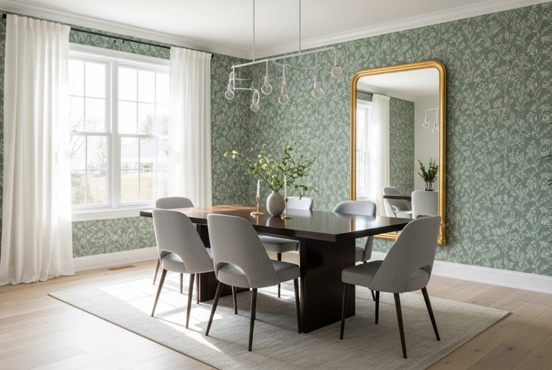
Sage green dining room wallpaper patterns often play a quiet game. From across the room, they look solid. Up close, vines appear. Lines repeat. Shapes overlap. That subtlety is what keeps people interested longer. Medium to low contrast patterns have been shown to reduce visual fatigue compared to high-contrast designs, which helps explain why sage wallpaper tends to age well.
Floral patterns in sage don’t feel flowery in the obvious way. They feel botanical, academic even, like pressed leaves in an old book. Geometric sage patterns lean architectural, especially when white lines are thin and precise.
I once ran my hand along a sage patterned wall during a conversation. Didn’t realize I was doing it until someone pointed it out. That texture thing works on people.
Darker sage for rooms that want weight
Dark sage green wallpaper in a dining room carries more authority than you expect. It’s not forest green dramatic, but it’s serious. White motifs or negative space become crucial here, breaking the depth so the room doesn’t feel swallowed.
Housing interior data shows darker wall colors increase perceived intimacy, especially in rooms used for social gathering. That’s dining rooms, whether they admit it or not. Dark sage makes meals feel deliberate, like the table setting suddenly matters more.
Candles behave better against dark sage. That’s not scientific, but light diffusion studies do show darker matte surfaces reduce glare, which explains why candlelight looks softer in these rooms.
Vintage sage feels older than it is
Vintage-inspired sage green dining room wallpaper often uses faded whites, imperfect repeats, and slightly off geometry. This gives the room a memory it didn’t earn yet. Restoration-focused interior trends show muted greens dominating heritage-style wallpaper sales, especially for dining spaces where people want warmth without nostalgia overload.
These patterns forgive wear. A scuff doesn’t scream. A shadow doesn’t bother anyone. The wallpaper already looks like it’s lived a little.
There’s comfort in that. Even if you can’t explain it.
Furniture reacts whether you planned it or not
Sage wallpaper quietly bullies furniture into behaving. Loud chairs calm down. Natural wood looks richer. Black accents either work beautifully or feel too sharp, no middle ground. White trim suddenly matters more than before.
Behavioral design research suggests softer wall colors lead homeowners to choose simpler furnishings over time. You might not notice it happening. One chair swap here. A table runner gone there. The room slowly edits itself.
Sage does that. It edits without asking.
Practical stuff nobody likes talking about
Sage green wallpaper shows installation mistakes in weird ways. Not immediately, but later. Slight seam misalignment becomes visible as light changes throughout the day. Dining rooms see this more because people sit and stare. Trade surveys consistently rank dining rooms high for wallpaper regret tied to rushed installs.
Humidity matters too. Dining rooms experience heat spikes and moisture more than bedrooms. Wallpapers with breathable backing perform better long-term, with fewer edge issues reported after several years. That’s boring info, but expensive to ignore.
Nobody brings this up when you’re picking samples. They should, but they don’t.
Ending
Sage green dining room wallpaper ideas aren’t about making a statement. They’re about setting a tone that keeps adjusting itself. Calm, then thoughtful, then slightly serious, then relaxed again. It shifts with daylight, with food, with who’s sitting at the table.
You don’t choose sage because it’s trendy. You choose it because it doesn’t get tired of you quickly. And for a dining room, that patience counts more than people admit.
Last modified: January 29, 2026